
Professional Book Typesetting Services UK | Pyramid Publishing
Hire a Book Typesetter to Give Your Interior the Design Quality of a Traditionally Published Book
If you’ve searched “book typesetting service UK,” “hire a typesetter for my novel,” or “professional interior book design,” you’ve likely already noticed the difference between a self-published book that merely looks formatted and one that looks genuinely designed. That difference considered font pairing, elegant chapter openings, proper spacing rhythm, thoughtful running headers is typesetting, and it’s one of the most underrated investments a self-published author can make.
Pyramid Publishing offers professional book typesetting services, providing the detailed interior design craft that turns a technically correct manuscript into a book that feels, reads, and holds up next to traditionally published titles on the same shelf. This page covers exactly what typesetting involves, how it differs from basic formatting, and what our process looks like from manuscript to finished interior design.
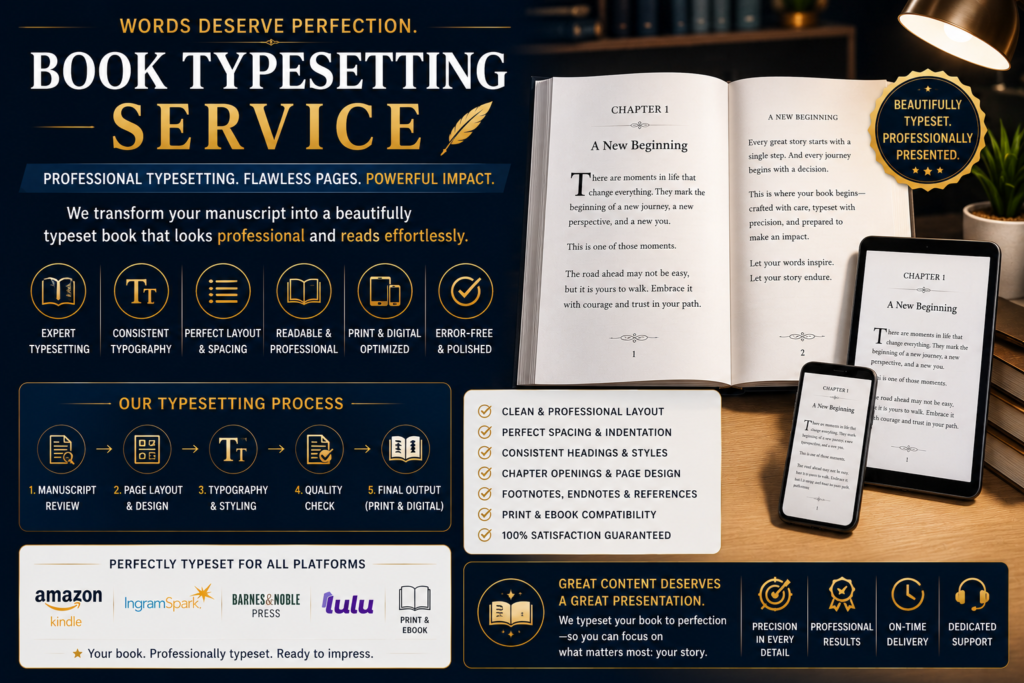
What Is Book Typesetting, Exactly?
Typesetting is the craft of designing a book’s interior layout the specific choices about typography, spacing, and page architecture that determine how comfortable and professional a book feels to read. If you’ve searched “what does a typesetter actually do,” here’s the honest breakdown:
- Font selection and pairing choosing typefaces for body text, chapter headings, and front matter that suit your genre and reading experience
- Line spacing, leading, and kerning the fine-grained spacing decisions that determine whether text feels comfortable or cramped to read for hundreds of pages
- Chapter opening design drop caps, ornamental dividers, or custom chapter number treatments that signal a new section elegantly
- Running headers and footers page-top and page-bottom design elements (often author name and book title) that appear consistently throughout
- Widow and orphan control manually adjusting text so single words or lines don’t awkwardly strand at the top or bottom of a page
- Hyphenation and justification rules controlling how text wraps and breaks to avoid unsightly gaps or excessive hyphenation
None of this is about whether your file technically works on Amazon it’s about whether the reading experience feels considered and professional, the kind of subtle design quality readers notice even if they can’t always articulate why a book “feels” well made.
Typesetting vs Formatting: What's the Real Difference?
This is one of the most common points of confusion for authors, and a fair question if you’ve searched “typesetting vs formatting UK” or “do I need both formatting and typesetting.”
Formatting is the technical process of preparing a manuscript file to meet a platform’s requirements a working table of contents, correct file type, functioning navigation, and files that pass Amazon KDP or IngramSpark’s validation checks. Every published book requires formatting; it’s a non-negotiable technical baseline.
Typesetting is the design layer built on top of that technical foundation the typography, spacing, and visual polish that separates a merely functional interior from a genuinely well-designed one. A book can be perfectly formatted (technically compliant, no errors, uploads successfully) while still looking visually plain or generic. Typesetting is what elevates it further.
Think of it this way: formatting ensures your book works. Typesetting ensures your book looks and feels like it was made by people who care about the reading experience the kind of subtle quality that influences reviews mentioning “beautifully produced” or “feels like a real book,” even though most readers couldn’t name the specific design choices responsible.
For most straightforward fiction, professional formatting alone is often sufficient. For authors specifically wanting a premium, design-forward interior particularly for print editions, gift books, poetry collections, or non-fiction with complex layouts full typesetting is the service that delivers that extra level of polish
Our Book Typesetting Services
Fiction Interior Typesetting
Searching for “typeset my novel” or “novel interior design service“? Fiction typesetting focuses on:
- Genre-appropriate typography (literary fiction, romance, thriller, and fantasy each carry different typographic conventions readers expect)
- Elegant chapter opening design, including drop caps and ornamental elements where appropriate
- Consistent, comfortable body text spacing optimised for long-form reading
- Scene break formatting (ornamental dividers or spacing conventions between scenes)
Non-Fiction & Complex Layout Typesetting
Non-fiction typesetting often involves considerably more complexity than fiction. Our “non-fiction typesetting service” covers:
- Table and chart design integrated cleanly into the page layout
- Sidebar and callout box design for supplementary content
- Footnote and endnote formatting that doesn’t disrupt reading flow
- Index typesetting with proper cross-referencing
- Multi-column layouts where appropriate for reference or workbook-style content
Poetry Typesetting
Poetry has entirely distinct typesetting demands compared to prose. If you’ve searched “poetry book typesetting” or “how to format a poetry collection for publishing,” we handle:
- Precise line break and stanza spacing preservation (critical, since poetry formatting errors change meaning, not just appearance)
- Title and section divider design for poetry collections
- Page layout decisions for poems of varying length, avoiding awkward mid-poem page breaks wherever possible
Academic & Technical Typesetting
For academic manuscripts, theses, or technical non-fiction, our “academic typesetting service” covers:
- Citation and reference formatting to discipline-specific standards
- Equation and formula typesetting where required
- Consistent heading hierarchy for multi-level chapter and section structures
- Figure, table, and caption numbering and cross-referencing
Children’s Book Typesetting
Children’s book typesetting requires close coordination between text and illustration. Our “children’s book typesetting service” covers:
- Text placement around illustrations for picture books
- Age-appropriate font sizing and spacing for early readers and chapter books
- Consistent design treatment across full-colour and black-and-white interior sections
Custom Chapter & Section Design
Beyond the technical spacing decisions, typesetting includes genuinely creative design choices: custom chapter number treatments, decorative section dividers, part-title pages for multi-part books, and cohesive front-matter design (title page, copyright page, dedication) that matches your book’s overall aesthetic rather than using a generic default template.
Series Typesetting Consistency
For multi-book series, we maintain a consistent typesetting template across every title the same font choices, chapter opening style, and interior design language so your entire series feels cohesively branded on a reader’s shelf, not just individually well-designed books that don’t visually relate to one another.
Print & Digital Dual Typesetting
While typesetting’s most visible impact is in print editions, we also adapt key design elements for eBook formats where technically possible since reflowable eBook text has real constraints on what fixed typographic choices (like exact drop cap positioning) can carry over, we advise honestly on what will and won’t translate to digital formats
How Much Does Book Typesetting Cost?
If you’ve searched “typesetting cost UK” or “how much does professional typesetting cost,” pricing generally depends on:
- Manuscript length a 400-page novel requires substantially more design and spacing work than a 150-page novella
- Design complexity straightforward fiction typesetting costs less than non-fiction with tables, footnotes, and complex layouts
- Level of customisation a fully custom chapter design with bespoke ornamental elements costs more than a refined but simpler template-based approach
- Genre-specific requirements poetry and children’s books typically require more manual, line-by-line attention than standard prose
- Series consistency work typesetting a five-book series with a shared design template is usually more cost-effective per book than typesetting five unrelated titles separately
We provide a free quote based on your actual manuscript and design goals, rather than a flat per-page rate that doesn’t account for how much genuine design complexity your specific project involves
Who Needs Professional Typesetting?
You’re likely a strong fit for this service if you’re asking:
- “My book is formatted and technically works, but it doesn’t look as polished as traditionally published books why?”
- “I want a premium, gift-worthy print edition what does that actually require?”
- “How do traditionally published books get that professional interior design look?”
- “I’m publishing a poetry collection and worried standard formatting tools will break my line breaks”
- “I’m publishing a series and want every book to look cohesively designed”
If any of these sound familiar, typesetting is the specific service layer beyond basic formatting that addresses exactly this gap.
Our Book Typesetting Process
Step 1: Design Consultation We discuss your genre, target audience, and design goals including any reference books or design styles you admire to establish direction before any work begins.
Step 2: Manuscript Review Your final, edited manuscript is reviewed for content that requires special typesetting attention: tables, poetry, footnotes, images, or complex heading structures.
Step 3: Typographic Design Concepts We present font pairing and chapter-opening design concepts for your approval before applying them across the full manuscript, so you’re not waiting until the end to see the design direction.
Step 4: Full Interior Typesetting Once a design direction is approved, we typeset the complete interior every chapter, section break, and piece of front and back matter to a consistent, polished standard.
Step 5: Widow, Orphan & Spacing Refinement A detailed manual pass adjusts spacing, hyphenation, and line breaks throughout, catching the small details automated tools consistently miss.
Step 6: Proof Delivery & Review You receive a full print-ready and/or digital proof to review the complete typeset interior before final sign-off.
Step 7: Final File Delivery You receive final, print-ready files formatted to your chosen printing platform’s exact specifications (KDP Print, IngramSpark, or other print-on-demand providers).
Common Typesetting Mistakes in Self-Published Books
Readers and reviewers often notice these issues even when they can’t name what’s technically wrong. If you’ve searched “why do self-published books look different from traditional books,” these are usually the reasons:
Default template fonts used throughout. Many formatting tools default to a small handful of common fonts, and readers who consume a lot of self-published fiction can often spot the same one or two default templates repeated across unrelated books it’s a subtle but real signal of an unpolished production.
Inconsistent spacing between chapters. Without careful manual attention, chapter openings can end up with varying amounts of white space above the first line, which reads as sloppy even if no individual page looks obviously wrong in isolation.
No widow or orphan control. Single words stranded alone at the top of a page, or a single line of a paragraph isolated at the bottom, are a hallmark of automated formatting that skipped manual refinement professional typesetting catches and fixes every instance individually.
Justified text without proper hyphenation settings. Fully justified paragraphs (flush on both left and right margins) without correct hyphenation rules often produce distracting gaps of white space within lines, sometimes called “rivers” running down the page a classic sign of unrefined typesetting.
Generic or missing chapter opening design. A chapter that simply starts with “Chapter One” in the same font as the body text, with no visual distinction, is a missed opportunity even a small design touch (a drop cap, extra spacing, a subtle ornament) signals intentional design care to readers.
Running headers that don’t match the book’s tone. Default running headers (often just “Chapter X” repeated mechanically) are a small detail, but mismatched or overly generic headers can undercut an otherwise well-designed interior
Typesetting for Different Print Formats
Typesetting decisions also need to account for the physical print format you’re targeting, since the same interior design doesn’t always translate cleanly across formats. We tailor typesetting specifically for:
- Mass-market paperback smaller trim sizes requiring tighter, more space-efficient typography choices
- Trade paperback the most common self-publishing format, offering more typographic flexibility than mass-market sizing
- Hardcover with dust jacket typesetting decisions coordinated with cover wrap and spine design for a cohesive final product
- Large print editions accessibility-focused typesetting with larger font sizes and adjusted spacing for readers who need it
- Special/gift editions premium paper stock considerations, additional ornamental design elements, and sometimes deckled-edge or foil-detail coordination with your printer
If you’re planning multiple print formats for the same title (for example, both trade paperback and a limited hardcover edition), we can typeset each appropriately rather than forcing a single design template to awkwardly serve formats it wasn’t built for.
Contact Us
Fill in Your Contact Details And We Shall Get Back To You Within 1-2 Hour Time Window!
Get in Touch with Us!
Reach out today and let’s turn your ideas into a book you’ll be proud of. Your story matters, let’s share it with the world. We keep you involved at every step, making publishing a transparent, empowering, and stress-free experience.
- (+1) 628-866-2100
- (+44) 7400-700-612
- pyramidpublishinguk@gmail.com
- Merchant's Quay, Salford, Salford Quays M50
Frequently Asked Typesetting Services Questions
Do I need typesetting if my book is already formatted?
Not necessarily formatting alone is sufficient for many self-published books, particularly straightforward genre fiction. Typesetting is worth the additional investment if you specifically want a premium, design-forward interior, especially for print editions.
Can typesetting be applied to an eBook, or is it print-only?
Typesetting’s most visible benefits apply to print editions, since fixed-layout design elements don’t always translate to reflowable eBook text. We can carry over key elements (fonts, chapter styling) to eBook formats where technically possible, and will advise honestly on what won’t fully transfer.
How is typesetting priced differently from formatting?
Typesetting typically involves more manual, detail-level design work than standard formatting, so it’s priced accordingly but we offer both as separate services so you’re never paying for design complexity you don’t actually need.
Can you typeset a book that was formatted elsewhere?
Yes. Typesetting is a standalone service, and we regularly typeset manuscripts that were previously formatted (or self-formatted) elsewhere.
Does typesetting affect my table of contents or navigation?
No typesetting focuses on visual interior design. Navigation and table of contents functionality remain part of the formatting layer, which we ensure stays intact and functional throughout the typesetting process.
Is typesetting worth it for a standard genre novel, or only for premium editions?
It depends on your goals. If you’re prioritising speed and budget for a straightforward genre release, professional formatting alone is often sufficient. If you’re building a long-term author brand, publishing a series, or want your print editions to feel genuinely premium, typesetting is where that extra quality becomes visible to readers.
Can you typeset poetry without disrupting line breaks and spacing?
Yes poetry typesetting is one of our specialist services specifically because standard formatting tools frequently break intentional line and stanza spacing, which we handle with careful manual attention instead
Ready to Give Your Book a Professionally Designed Interior?
Whether you’re publishing a debut novel, a poetry collection, or a multi-book series, Pyramid Publishing’s typesetting team brings the detailed design craft that turns a technically correct manuscript into a genuinely well-made book.
Request your free typesetting quote today and see what a professionally designed interior could do for your book.